Design Systems: a ruleset for how to approach creating a style for your website.
So, a “ruleset” may not be the right term for this. The three articles that this post discusses focuses on Spacing, Grids, and Layouts; Typography; and Content Strategy. There are no true “rules” for what works and what does not. However, there is a plethora of things to think about in regards to generating a style guide. The primary thing to think about in this though is to remember the following things:
- Everything is consistent with each other. (Consistency)
- Consistency helps the user understand and navigate a UI better. (Understandability)
I’ll break down my interpretation of these.
Consistency
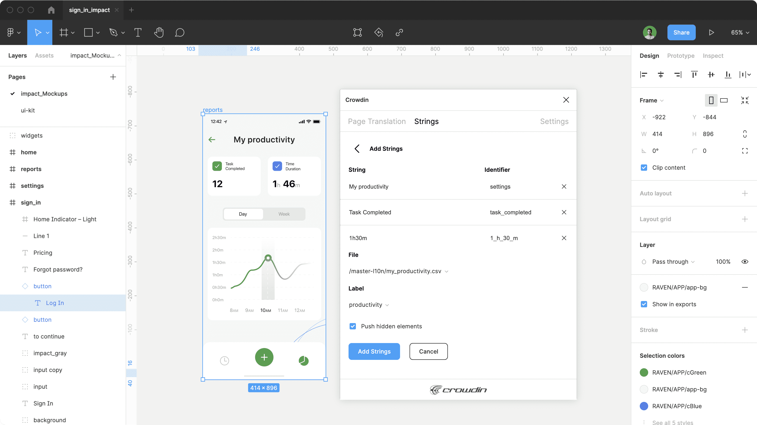
One of the things that the developers of Figma realized as they built tools to help others create and improve their own UIs was that their own website, documentation, and interfaces didn’t follow many of the rules of consistency that they themselves promoted. Fonts weren’t consistent between use-cases, spacing wasn’t the same in re-used formats, and there weren’t consistent ideas of reusable elements and objects despite that many of the same elements and objects were utilized over and over again. Further, design tools for users didn’t feature ways to utilize the idea of reused objects, which breaks the design principles that the users should be following in development.
Long story short, Figma worked to overcome these issues, but that’s not the point of the story. The point I’m trying to make is that Consistency is incredibly important in UIs. It promotes a sense of trust in the user for the UI. Additionally, a consistent UI is one that a user has an easier time understanding and using (more on that in the next section). Consistency also improves development time both for prototypes in tools like Figma and in the actual development of the live websites. Being able to reuse the same style of element repeatedly can drastically lower the amount of time it takes to create a functioning website, since elements like headers, buttons, and the format of type are used constantly across the entire site.
Understandability
The second key takeaway is that the site needs to be easily understandable by its users. Consistency plays a huge part in promoting this aspect for the user, but Understandability provides a motivation for why a consistent style is necessary across the website. Consistent elements highlight to the user that these elements will do similar things: a button that looks the same as another button has a similar function–though the wording on buttons is different, buttons that have the same style and same coloring generally mean they are of the same importance. A primary color button signifies that it is the task that lets the user proceed to the next task, so keeping primary buttons looking similar means that the user can identify how to move to the next task without really reading the text on the button or puzzling out what the button is supposed to do. After all, some tasks are more complex than one or two words on a button can truly display well to the user.
So as a wrap-up, I think the primary thing to takeaway here is the fact that Consistency promotes Understandability.
