Driven by my desire to teach myself how to play acoustic guitar this year but lacking the means to find good online resources, I decided that I probably wasn’t alone in this struggle. I wanted to build a way for amateur musicians, people like me, to be able to find comprehensive resources to teach themselves music in a fun yet simple and efficient manner. I decided on the idea of building a mobile application (primarily for tablet usage) that builds lesson plans based on a user’s background of music knowledge. However, since I am neither a great musician nor a music teacher, I lack the ability to build lesson plans or create videos for potential users to watch; therefore, I decided that my interface would primarily be focused on the experience of building an account and entering information necessary for the application to create a lesson plan and schedule lessons and whatnot.
This early planning was accompanied by a user story I created off the persona of potential users. This story (which can be viewed in its entirety here), focuses on a person named Liam with similar aspirations of learning guitar as myself, but has neither the financial resources or motivation to regularly travel for in-person guitar lessons with a professional. He decides to purchase a second-hand pawn shop guitar and sign up for this application, which takes his preferences and background and compiles a list of lessons that move at a speed he is willing to work with and prompts him to practice a few times a week.
I feel like this persona and story can describe a large number of people with aspirations to learn music but don’t: many people either don’t have resources for in-person lessons or feel intimidated by the prospect, so this interface can add value to these users’ lives by creating a single source for music lessons without taking money, more time than is required to learn and practice, and is primarily conducted through a series of videos so people don’t have social or health concerns in today’s post-pandemic world.
For reference, I am the sole contributor for this project.
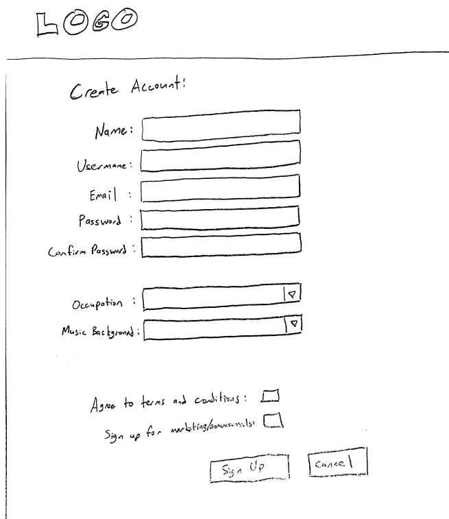
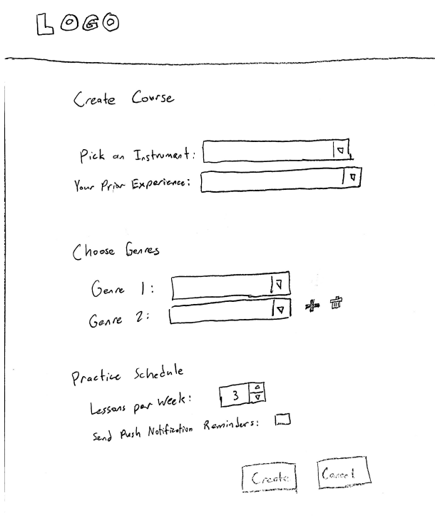
Early Sketches
I began the design process with a pencil and paper. Pictured below are two of the screens of the application. They are both simple form pages, as I intended these to have as little complexity as possible. Beneath both of the following images is a Figma embed of my mockup, including the digitalization of these two screens and two other simpler screens in the application.
Design System
The above mockup utilizes element designs that I included in the below embedded design system I’ve used throughout the project. I picked a color scheme that was simple and elementary in nature – in part of the simplicity mantra I focus on, but also in part because I feel the elementary nature ties into the educational nature of the application. These primary colors aren’t used extensively in the application, but each has a very specific usage: green for confirmations, blue for information and selection, and red for deletions and warnings. Additionally, you may notice that the darkest color is not actually black–it is a warmer dark gray that I feel removes some of the coolness that true 0x000000 black inherently adds to interfaces. This not-black still has all of the contrast necessary to make sure text color is accessibility friendly and easy to read, but it helps to make users feel a bit more intrinsically comfortable with the interface. Other than the coloring options, I tried to make sure most everything else felt as standard to other interfaces as I could. Keeping with the status quo of website design helps ensure simplicity and ease-of-use and lets users stay efficient with how they use and navigate the application.
Prototyping
The below Figma prototype is directly based on the mockups pictured beneath the Early Sketches section. Feel free to go to fullscreen to click through the application and see what everything looks like. Due to some limitations of Figma, text-fields fill in on click rather than accepting user input; and on dropdowns only specific choices are allowed, but clicking on a wrong selection should highlight a correct one that lets you proceed.
After developing this prototype, I had the opportunity to share this prototype with a colleague working on a different interface design project. This person was able to highlight a number of surface-level strengths and weakness with the application. He thought that I leaned into the simplicity value very well, as the interface does utilize a lot of status quo design elements. However, there were some things that could have led to better efficiency: a back button on the Lesson page to let users return to the Courses page, adding a dropdown to some of the fill-in text fields that aren’t inherently clear, marking fields as required when necessary, being able to click the video itself on the Lesson page instead of just the small play button on the bottom left, and a couple wording changes. I implemented all the suggested changes before going to the next phase of the project, as these were all simple changes that could vastly improve the user experience by creating better signifiers for what a user can do where.
User Testing
For this project, I interviewed two types of people that I split into two personas. The first persona is very much the one described in the user story above, so I’ve named it Liam. The second persona is a music educator named Rachel looking to expand her toolset for educational resources for her students, so she is experimenting with the interface to see if it will fit her needs. Both of these personas provided valuable feedback, though in general, both were less interested in the account creation side and more interested in the potential of the lessons themselves.
I conducted these tests using a script that led users to give first impressions of the introductory create account screen (without interactions), then led them through a series of three tasks so that each user created an account, created a course, and went through one day lesson. I didn’t have a lesson video to watch due to my personal inability to teach music, so for the final task, the user only needed to navigate to the lesson, click the video to have it immediately finish, then navigate back to the home screen.
There were a few primary themes that boiled down into a selection of five different usability issues I’ve elected to fix for the below final draft of this project. These themes boiled down to a distaste for too much or non-specific information gathering (specifically the occupation dropdown), weird wording or illogical presentation of form elements, a lack of distinct change in elements when they go from disabled to enabled, and the idea that the app felt like it belonged on desktop rather than on a mobile device.
I’ve chosen to help rectify these themes by identifying the following problems and implementing respective fixes in the final draft:
- Problem: Users don’t like the field that asks for their occupation during account creation
- Fix: Remove this field
- Why: This issue was present in the first round of user tests — there was a change to help rectify it but it was iterated again that users don’t really think it is necessary to know occupation, so it should be removed.
- Problem: Confusing when the course creation begins with two dropdowns for genre and only one genre is wanted by the user
- Fix: Remove the second genre field from the course creation and have the delete button disabled until a genre is added
- Why: Every user that tested the app ran into issues where they tried to move on during the course creation task without deleting the second (empty) genre dropdown and were confused until I helped them proceed. This is clearly an issue because it isn’t inherently obvious that the user needs to remove any genre dropdowns they aren’t using.
- Problem: Users don’t understand the “Your Background” dropdown on course creation and how it differs from music background during account creation
- Fix: Modify the wording to “Experience on this Instrument” and change the choices to “Beginner”, “Intermediate”, “Advanced”
- Why: There is a similar field in the account creation that refers to a user’s overall musical background, whereas this dropdown refers to the user’s experience with the selected instrument. This is confusing and should be changed to remove any indecision or confusion from the user’s workflow.
- Problem: Buttons don’t have a distinct enough visible change between disabled and enabled
- Fix: Change the color system to make different shades of colors far more distinct
- Why: Users pointed out that they saw there was a slight change in the coloration when a button became enabled/disabled, but they thought it wasn’t a very significant change. This indicates that it needs to be changed for accessibility reasons — if users that don’t have issues with colorblindness can hardly see a visual change like that, colorblind users will not be able to notice a difference between disabled and enabled buttons
- Problem: The page header makes the app look more like a website and less like a standard mobile/tablet app
- Fix: Remove the top header, since it is wasted space, and add a mobile-standard navbar at the bottom of the screen
- Why: Managing user expectations is important, and one user asked why I was having them test a webpage on an iPad interface. Since this program is intended to be a mobile application, I should change the navbar of the application to be more consistent with other mobile applications — specifically this includes moving the navbar to the bottom of the screen and having icon-based navigation rather than words.
Final Draft
I don’t think this final draft is industry-ready. One of my primary shortcomings I’ve identified in this application is that I haven’t utilized creative design enough. In pursuit of simplicity and efficiency, which I feel like I have embodied reasonably well, I have neglected some of the character of the interface, which probably will end up leading to boredom or disinterest from users. This being said, a crutch assumption I have with this interface is that most of the user’s interaction with the interface will be in the lesson videos, which can compensate for a lack of character across the rest of the website, but the final addition of the mobile-esque navbar in this final draft proves that creativity isn’t only limited to the unimplemented videos. Perhaps I’ll explore with this interface more in the future, but for now I think I’ve learned as much as I can from this exercise.