An analysis of PayPal’s website and the choice, location, and usage of color.

I found PayPal to be incredibly intentional with the colors they use. On this page alone, there’s huge number of colors, though there are only a handful of standout colors. Most importantly: the blue primary color that’s used in the Contact Sales button, Sign Up button, the lighter line color in the infographic, and various other hyperlinks to other parts of the website. Secondly: the dark blue color that’s used in the Log In button, navbar Sign Up button, the darker line color in the infographic, and a couple other accent places on the page. Both of these colors are not only used in this page extensively, but are used in PayPal’s logo, so are the face of the all the branding that PayPal utilizes. Two other important colors are the mint green color that is used in the text just beneath the navbar and in one of the infographics as well as the light gray background color in the page section at the bottom of the screen cap. These four colors are primarily what I focused on in my analysis and recreations of the website. Speaking of:

The only places I’ve directly omitted color from the screen capture are the logo present in the left side of the navbar (due to the graphic design limitations of Google Slides), and the two smaller infographics in the right side of the page body (partly due to graphic design limitations and partly because I think the colors present in those areas are less directly related to PayPal’s color scheme and more meant as accent colors in an unimportant part of the page). I included the largest of the three infographics because the primary colors in that graphic are also PayPal’s primary colors, so I felt it was another helpful area to showcase the new color schemes in the color redesigns of the site.
PayPal’s color scheme on their website fits a very professional tone. Outside of white space and neutral colors, which serve their own purposes of making the consumer buy-in and trust the website more, blue shades are the most used colors on the site. It fits the professional tone, as these blue colors avoid shades of warmth to invoke playfulness (like pastel tones would), but instead successfully attempt to invoke ideas of authenticity and reliability. Additionally, there is a shade of green used as an accent color to draw attention temporarily away from the neutral tones and the blues.
Alteration 1: Subtle Recolor
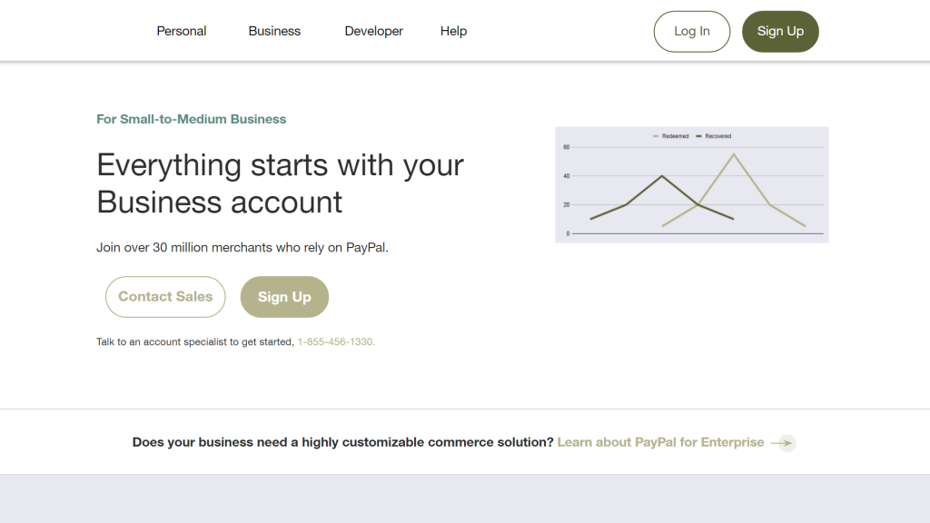
This recolor attempts to tie more into a relaxed and subtle atmosphere, to invoke fewer thoughts and remove emotions from the ideas of making and dealing with money. It uses beige and taupe tones with undershades of green, and attempts to have a bit more cooler colors in the neutral tones of the website to invoke a neutral atmosphere that might be connected to tones of calmness or nature.
I don’t think this recolor works well for the website, as PayPal wants to invoke emotions with their color scheme. Additionally, on a design standpoint, I really don’t like how the neutral pastel purple color came out from the color scheme I chose.
Alteration 2: A Rich Recolor
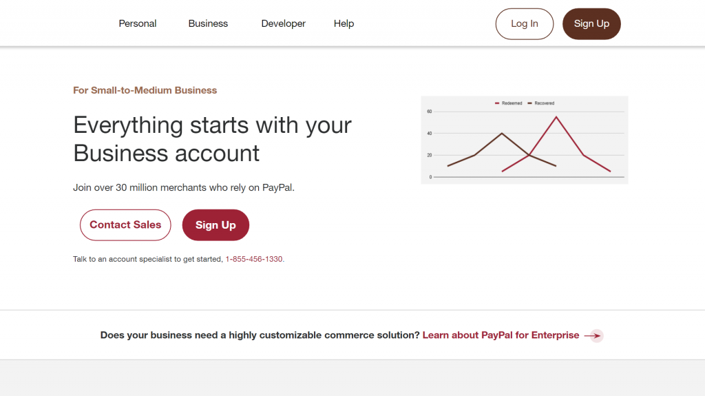
This recolor attempts to tie in a color scheme of richness with reds and browns, invoking classic thoughts of wealth and richness by using colors associated with fine foods and wines. There’s an underlying aspect of richness to working with money, so this color scheme attempts to leverage these thoughts with how it projects itself to the customer. Unlike the previous alteration, I did not touch the original neutral colors, as any alterations that would fit with the rest of the color scheme would end up becoming a gross shade of papyrus or parchment yellow.
I’ll admit, I’m partial to this recolor. I don’t really think it fits the ideas and values that PayPal truly wants to invoke, but it is at least an interesting thought experiment. Additionally, it has far better contrast than the previous example’s color palette did in regards to how colored words show up on the background and distinguish themselves from the words in neutral shades.
Alteration 3: A Timeless Recolor

This recolor attempts to tie in a color scheme of timelessness: that of old or ancient wonders and monuments that have stood the test of time to be relics of a bygone age in a modern era. It uses a navy color as its primary signifier, an olive green as its secondary, and a cool gray that straddles the line between blue and green as its neutral. Interestingly enough, these colors also invoke thoughts of physical money (in America at least), which makes it a somewhat fitting color scheme.
Though the theme of this color scheme could invoke thoughts of having money be safe and protected to stand the test of time, which is certainly an idea that PayPal would like its customers having, I don’t think the palette works too well. The dark shade of the primary color with the already black text in hyperlinks forced me to use the secondary color in these places to even have enough contrast with the text around it. Additionally, the colors, when used near each other, don’t have enough contrast with one another to effectively show a clear picture (primary example being the infographic). Additionally, I don’t think this color palette does enough to show PayPal’s values, even though it might do something.
Closing Thoughts
Though this was an interesting experiment (and I really do like the rich color palette still), PayPal did an excellent job at picking a color palette that fits its values and presents the correct message to the user. There’s no wonder why blue is such a common color among branding of companies across the world: the thoughts of reliability and authenticity are simply the most common values that companies want to showcase.