Thoughts on the Shneiderman PDF and how data types relate to my experience in data science
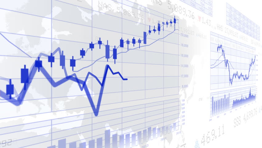
The Shneiderman paper discussed some interesting concepts in regards how to visually approach different data types. The seven basic data types listed are: 1-dimensional, 2-dimensional, 3-dimensional, temporal, multi-dimensional, tree, and network. There are specific ways that designers have figured out how to display certain types of data, and some are easier than others. In the case of 1-dimensional data, which makes up the large majority of most information that humans consume, it is generally easy to display. Textual documents like code, lists, or even the pdf that talked about these seven data types are comprised of 1-dimensional data. Humans consume data like this through reading data, and (according to Shneiderman) design problems are often how to focus on important data through fonts, colors, sizes, etc. With 2-dimensional data, data consumption is most often easiest through tables or graphs, much like the featured image at the top of the page. Trees and temporal data have a similar complexity in their data display methods, but when data begins to have more primary dimensions than 2, whether these dimensions are x and y axes, parent and child relationships, overlapping dates, or words on a page, it becomes exponentially more difficult to display this data.
My experience with these types of data is limited, but there is a lot of struggle in working with data in dimensions greater than 2. For example, in the data science courses I’ve taken in the past, there’s a common dataset used in learning clustering concepts that has chemical information on different wines. In the data set, there are a bunch of different entries that have specific chemical properties that make it possible to cluster these wines into the categories of either red wine or white wine. No clustering method is perfect in getting these wines right one hundred percent of the time, but the difficulty comes in visualizing the problems while trying to cluster the wines. Since there are 13 different attributes to each row of the data set, this data is treated as 13-dimensional data, which is not only near-impossible to display to a user viewing the data, but is basically impossible for humans to visualize. Since it’s extremely difficult to visualize what information looks like in anything greater than 3-dimensions, trying to understand what a graph of 13-dimensions would look like is mind-boggling. Try it out and see if you can wrap your head around it.
Computers don’t have the same limitations as people do in computing the similarities and differences in 13 dimensions. However, the visualization doesn’t work here even for computers. No graph is able to display a visualization of what the clusters look like without some set of dynamic queries and sliders (like what Shneiderman detailed in his paper), and this solution is still mediocre at best for visualizing the data.
In much a much less confusing number of dimensions, even 3-dimensional data is hard to convey to end users. Near every medium of data display is limited to 2 dimensions — even human vision is limited to only 2 dimensions with depth being perceived by our brains only because we have two eyes. Any display of 3-dimensional (or greater) data must either be limited to summaries or be turned into an experiential learning process. This can be done via the sliders and queries that Shneiderman detailed, or through an interactive experience where the user has the ability to “turn”, “move”, or “explore” simulations of 3+ dimensional settings. These are still not perfect at displaying complex data, but as technology gets more capable and impressive, so to will data transfer techniques.
Long story short: working with multi-dimensional data gets very complex very quickly.